 Headbanger’s Brawl is a weekly column where Metal Insider’s Bram and Zach take a moment to debate and analyze two opposing sides of a topical issue occurring in the world of metal and/or the music industry.
This week, two relatively high profile artists unveiled their album covers. While Opeth’s Heritage has gotten mixed reviews, Limp Bizkit’s Gold Cobra has been hated about as much as the band itself. The question Bram and Zach are debating in this week’s Headbangers’ Brawl is the following: How important is album artwork?
Bram: These week’s two album covers proved that people still care about judging a book by its cover. Especially in Opeth’s case, where there isn’t any music out yet, it’s really the first taste of things to come. Hell, there were multiple articles about the Lady Gaga’s horrible album cover. It’s really part of a band’s image. They’re branding themselves with every album cover, so they better have a good artistic representation of their band.
Zach: I think it’s especially interesting that cover artwork is still held so highly by fans considering how we live in a world of digital downloading. I’ve always hated to buy music from iTunes (or download illegally…don’t judge me) simply because it meant I couldn’t hold the CD booklet and look at the album cover for hours on end. But as it became more convenient to buy music online, the more I did. And just as unfortunate as that is, it’s also unfortunate that you just don’t get the same special feeling from looking at an album cover in your hands as you do on a blog site.
Ok, enough of me sounding like an old fart…I couldn’t agree more that an album cover is an important part of the album. I just fear that not every musician feels the same way anymore (seems like Gaga doesn’t).
B: I hate to stay on Gaga in a metal column, but I disagree with you. For someone whose image is arguably as important as her music, she definitely cares about what her album cover looks like. If you think she just said ‘fuck it, do whatever you want for the album cover,’ you’re wrong. She knew it would be obsessed over, and in talking about her album cover, they were talking about her. And the album.
Which brings me to a larger point. Many bands view an album cover (or the album itself) as part of a larger package. Tool comes immediately to mind, but other bands like Mastodon, Baroness, and Iron Maiden are closely linked in with the art of their albums. And that makes a physical album or CD worth picking up. You can’t spend hours looking at an MP3, and if you’re putting time into making the album artwork match the mood or music contained on the album, the fans will buy it.
Z: But two of those bands you just mentioned, Tool and Iron Maiden, don’t just release “album covers.” Their last albums were part of some special package or neat thing that added more value to the package
(Tool’s 10,000 Days had that special 3D packaging, while Maiden’s The Final Frontier had multiple hard copy packages that added onto its visuals). I’m not saying that cover artwork doesn’t have a role in consumer’s purchases, but I feel like the amount of bands that put so much detail or extra value into their covers and physical albums are very few.
And as for Gaga, does that mean that she CHOSE to make it look crappy? I’m not saying she put no thought into it, but if she wanted everyone to obsess over a cover, she could’ve done so much more (or at least something that doesn’t look like a crappy Photoshop project).
B: She didn’t choose to make her album cover crappy any less than she chose to make her music crappy. It’s her art, so of course she had final say over everything. She’s probably as happy with her album cover as she is wearing a meat dress. Not for everyone, but it got people talking.
And Maiden and Tool did do something more, but it’s basically just running with the idea of a good album cover and taking it one step further. But when an image of an eye-catching album cover is released,
like with the Opeth album, people will look at it online and say “whoa, that album cover’s amazing,” or “what are their heads doing in a tree? they lost me.” But even if they hate it, they’re saying ‘oh, I didn’t know Opeth had an album coming out.”
Z: That’s absolutely true. An eye catching cover does serve as a great promotional tool, even if it is crappy. For instance, even though I haven’t heard one person say anything good about Limp Bizkit’s new album cover (other than it’s somewhat better than the first attempt at Gold Cobra’s cover), it still reminded people that Bizkit is actually still around. And in this case, it’s not like a better cover artwork is going to make Bizkit bashers give the album a chance anyway.
With this in mind, Bram, is there an album cover that really popped out to you recently, both in a good and bad way? (and just for fun, let’s not include Opeth’s and Bizkit’s).
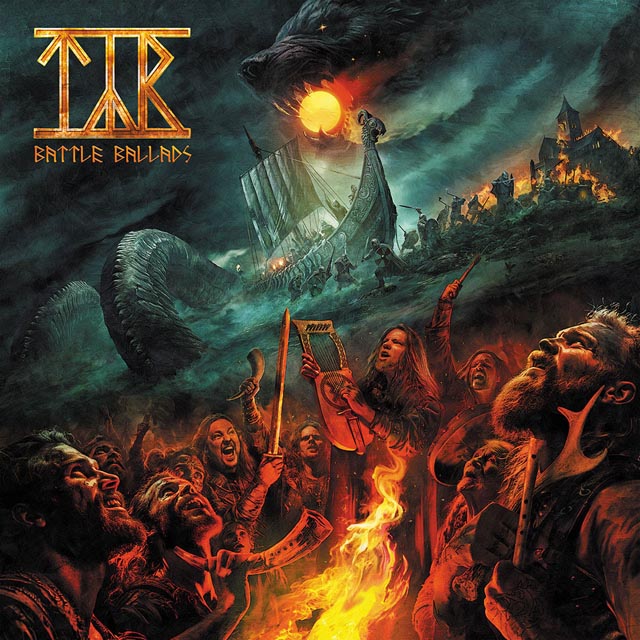
B: I think I’d go with Protest the Hero’s Scurrilous. It’s definitely cryptic, was made by the bassist’s uncle 60 years ago, and it gave the band an album title. You?
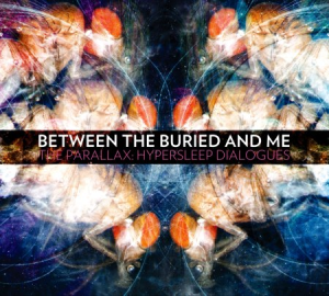
Z: For some reason, the cover of Between The Buried And Me’s The Parallax: Hypersleep Dialogues really stood out to me recently. Maybe it’s the colors that gave off the spacey vibe, but something about it seems to a perfect fit with the EP’s music. The cover, like the songs, has its moments of complexity yet a sense of simplicity as well. It works amazingly well.


