When you are talking about iconic metal bands you don’t get very far through the conversation before Metallica’s name gets dropped. Love or hate their post-Justice/Black Album material, pretty much nothing can taint their most classic releases at this point. Those classic albums also have some of the most recognizable artwork in metal history, adorning t-shirts, denim jackets, and bedroom posters for longer than most people would care to admit. So we decided to take a look at the history of Metallica album artwork and give a best guess at which artwork stands out amongst all others. Two things of note: 1) This is strictly based on artwork alone. What was contained within is secondary for this exercise and 2) We stuck with just the previous nine full-length studio albums. The newest release is still too fresh to dissect. (Also sticking to the full-length studio albums allows us to avoid having to discuss the immensely terrible album cover for the Garage Inc. compilation.)
9) St. Anger
The fist on the cover is as cartoon-like as the angst it was supposed to represent. It looks like it’s being bound by a piece of silver lace which detracts from the affect. The orange design leading into the fist is more compelling than the fist itself. With that said, there’s very few times red and orange make for an appealing color combination…this isn’t one of them. If you didn’t know who the artist was, would you be shocked if I told you this was a Pushead piece? After growing up in an era when Pushead’s work became an iconic part of the metal artwork lexicon this piece lacks teeth, and frankly seems pretty forced. (Much like the album it wound up representing.)
8) Reload
This is the second Metallica album to use part of a work from American photographer, Andres Serrano. Serrano would come to fame/infamy for his work “Piss Christ” in 1987 and has spent an entire career utilizing various bodily fluids in his work. Reload takes from a piece called “Piss and Blood” (of course). The Serrano portion of this cover is interesting. If you an get past the part where you are supposedly looking at blood and pee-pee the colors are quite vivid. This album gets docked major points though for reusing the same heinous fonts that its immediate predecessor did, as well as the silly, scribbled “RE” part of the title. If the band had chosen to release this album with just the image and no text at all this cover would have ranked much higher on this list.
7) Load
The first time Metallica utilized a Serrano piece, and the first time they went for something completely different on the artwork front by dipping their collective toes into Modern Art (or at least Lars and Kirk did). This time out they use a piece entitled “Blood and Semen III” which utilizes bovine blood and the artist’s own semen merged under a piece of plexiglass. (I’ve always loved stumbling across people online saying things like, “My friend said that Metallica’s Load album cover is a picture of blood and cum. Is that true? I don’t think it is.”) The Serrano piece is about as shocking as a black metal band using pig heads on stage. In other words, it just isn’t anymore, if it ever really was. However, once you get passed the attempt to shock and awe people the piece itself is intriguing. There’s a lot to digest when you really study it. James Hetfield has stated in interviews (specifically a 2009 interview with Classic Rock Magazine) that he hates this album cover, and specifically the Serrano piece they used. I’m not sure why because most of his venom should be directed at the crappy fonts used and the absolutely ridiculous rendition of the band logo. Again, if the album cover had just been the image itself with no text it would have ranked much higher here, but one of the worst band logos ever seen makes this thing plummet quite a bit.
Ukrainian metalcore outfit Space of Variations return with their new album, Poisoned Art, out now via Napalm Records (order here). Blending crushing heavy beats with raw emotional intensity, the band has delivered what is promised to be their most intense work to...
Portland, Oregon dark rockers Hoaxed have unveiled their sophomore full-length album, Death Knocks, out now via Relapse Records (order here). Marking a new chapter for the band, featuring Kat Keo, Kim Coffel, and new bassist/vocalist April Dimmick, the record arrives...
Italian blackened post-punk outfit Ponte Del Diavolo continue to evolve their dark, ritualistic sound with the arrival of their sophomore album, De Venom Natura. Emerging from Turin’s underground, the band has crafted a unique identity defined by their dual-bass...
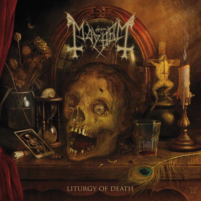
New & Noteworthy is Metal Insider’s weekly column highlighting some of the newest rock and metal releases coming out each week. The first New Music Friday of February sees LPs from the likes of Puscifer, KMFDM, Mayhem and Tailgunner amongst the many outstanding...
New & Noteworthy is Metal Insider’s weekly column highlighting some of the newest rock and metal releases coming out each week. This week’s new albums include music from the likes of Blackwater Holylight, Buzzcocks, Kula Shaker and MØL amongst the many outstanding...
New & Noteworthy is Metal Insider’s weekly column highlighting some of the newest rock and metal releases coming out each week. This week finds albums from the likes of Megadeth, Poppy, The Format, Crystal Lake, The Damned, Goldfinger and Rotting Christ...

 9) St. Anger
 8) Reload
 7) Load